Audio Summary Coming Soon
My IFB App
User Experience Design, Product design
2023
The Context
Though small, this project holds significance in my portfolio for addressing a crucial problem within the tool. It's a familiar challenge: adding features without considering the tool's primary objective. I've faced this issue in different organizations, and it's always fulfilling to pause, reflect, and steer the design in the right direction.


The project was initiated to evaluate the needs of an existing IFB customer and find opportunities to increase the usage of the app. The project focused on multiple functions and screens such as shopping, technical assistance, and content available on the home screen. In this specific project, we worked on enhancing the home screen of the app.
We had a live working app with thousands of customers using it, yet the objective behind the app was not clear within the team.
What started as an app to track complaints and service requests, quickly became an app to search food recipes and order detergent. How did this happen?
The problem at hand
There was need to ask the right questions and create a more clear objective for the app.
What was the purpose of the app when it was first developed?
Is that purpose being fulfilled now?
What is the current most used feature of the app?
What does the user journey of an average user look like?
Research and Discovery Insights
We worked with the development team to get data on the active users and their journeys.
The majority of users were using the app to track the service complaint for any product but to our surprise a significant percentage was also using to order detergent refills for their product
53%
Users - Tracking service complaints and appliance maintainence related updates
34%
Users - Ordering and reordering detergent and other regularly required products
10%
Users - Discovering new recipes and watching videos for new recipes.

How might we reduce the no. of steps for a user to track their application?
Asking the right questions
How might we provide an intuitive experience that allows the users to see what's important to them?
Banner was taking up more than 30% of the screen but was not used for any relevant feature
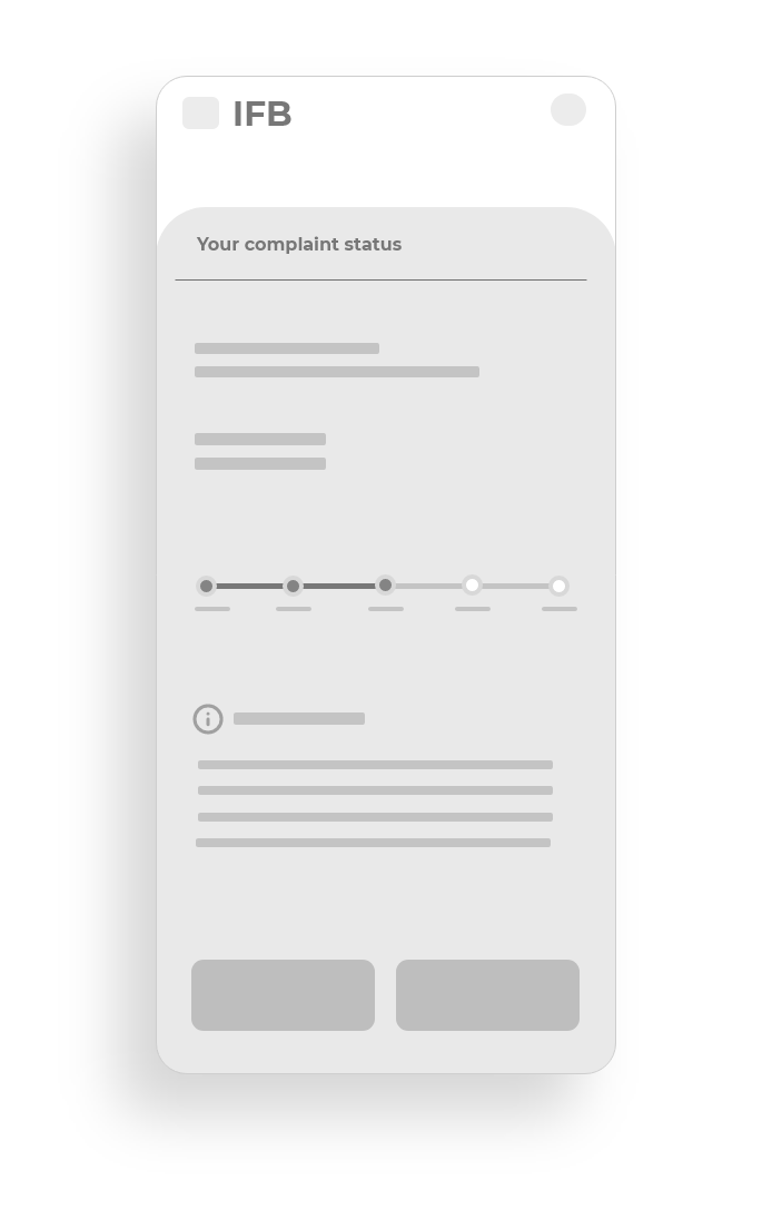
Tracking your complaint status required you to navigate to 3 different screens to finally find the required information
Audit Insights

Prioritizing the right actions for the home screen had a significant impact on the user journey. With a simple change, we reduced session clicks from 7 to just 2, making a remarkable difference.

Recalibrating the design direction
Home Low fidelity designs - I focused on providing the most used features on the home screen to reduce the time taken for the process. This also made the navigation much simpler for the users.
Complementary actions, such as suggesting related products for shopping, were implemented to streamline the user experience, reducing the number of steps required.


Prioritizing the right actions for the home screen had a significant impact on the user journey. With a simple change, we reduced session clicks from 7 to just 2, making a remarkable difference.
Proposed Solution


Complaint tracking was one of the primary action for users, so we made it simpler. Showing users their status of the complaint in the first go! We reduced the number clicks required to view you complaint from 7 to just 1 tap.


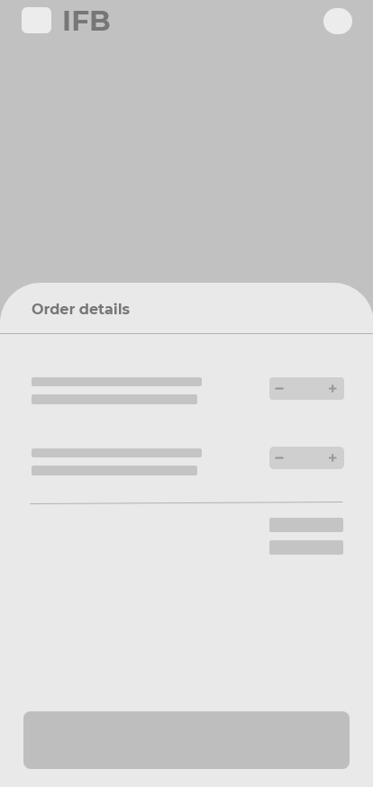
Our users reordered the products frequently, in our proposed solution we made it into a two-tap process that helps you order you monthly supplies very easy.